While at Farecompare as the sole product designer, I spent time on a variety of projects including:
- Redesigning the homepage and core flight search application
- Designing the auto rental and hotel search applications
- A deals portal
- Style guides and design system components
- Email templates for saved searches and deals
- Departure and destination landing pages for SEO and deals
- A getaway map application
Design Challenge
One of the challenges of working on these designs was the competing ways the company made revue. As the name implies, you are able to compare flights, hotels or auto rentals across companies but also across other websites. We could make money by the user booking from our site, or from sending the user off to a competitor. So there was a constant tradeoff between streamlining the onsite booking process and promoting third party ads.
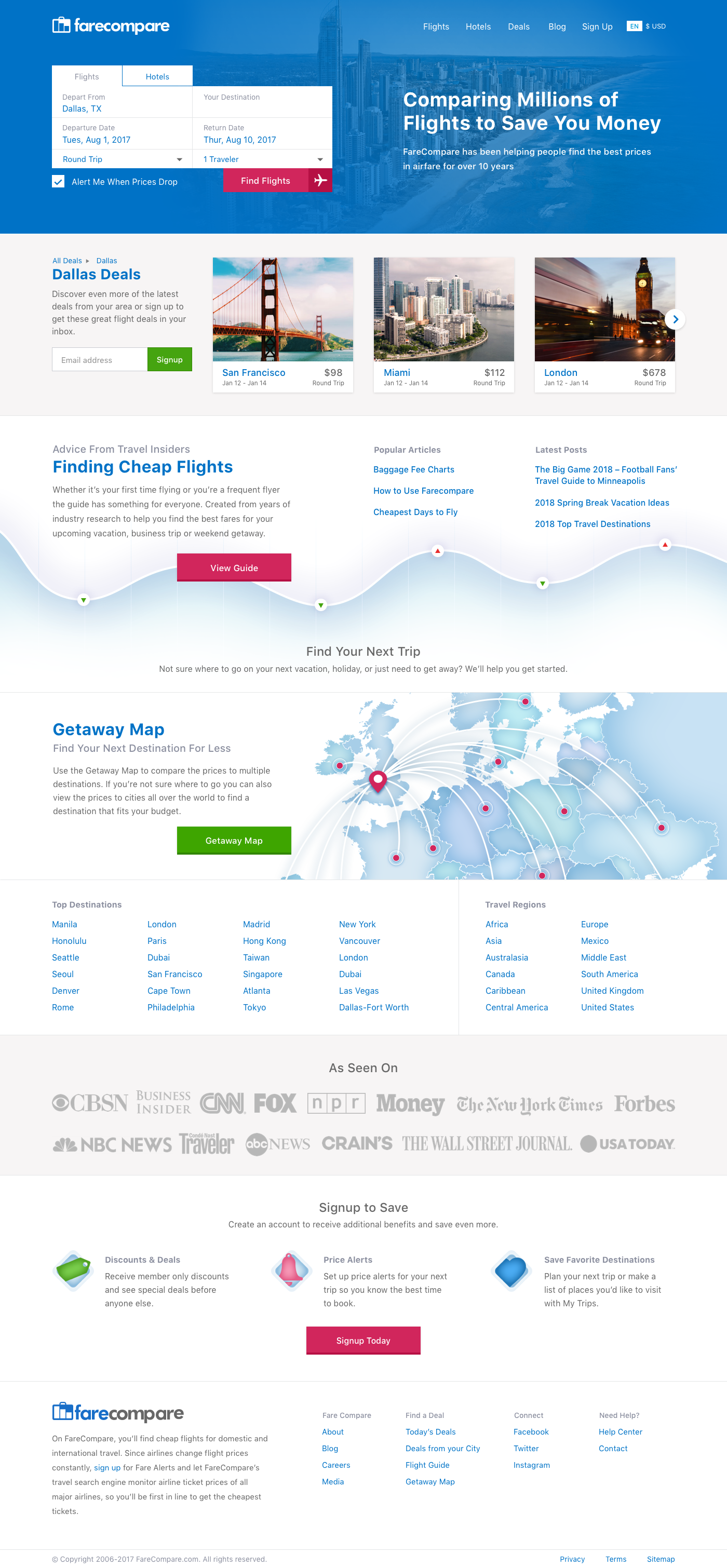
For the homepage, my focus was to keep the design aesthetic consistent with the other applications and provide a portal into the various applications we had created as well as be strong from an SEO perspective. Also, providing deals specific to their local estination and strong email signup CTAs.
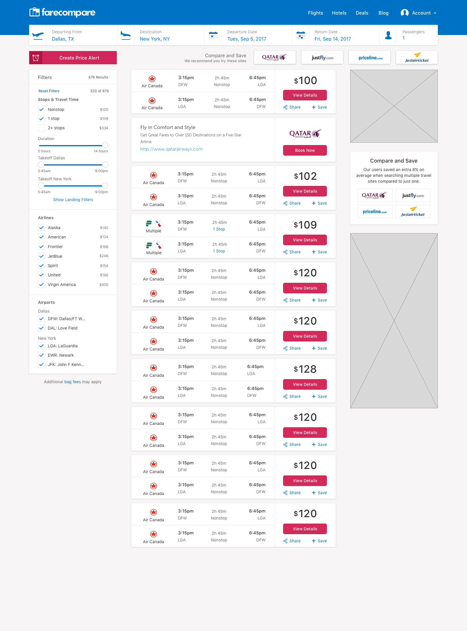
For the main flight search, I went with a clean layout which highlights the flight display but also provides space for ad placement.
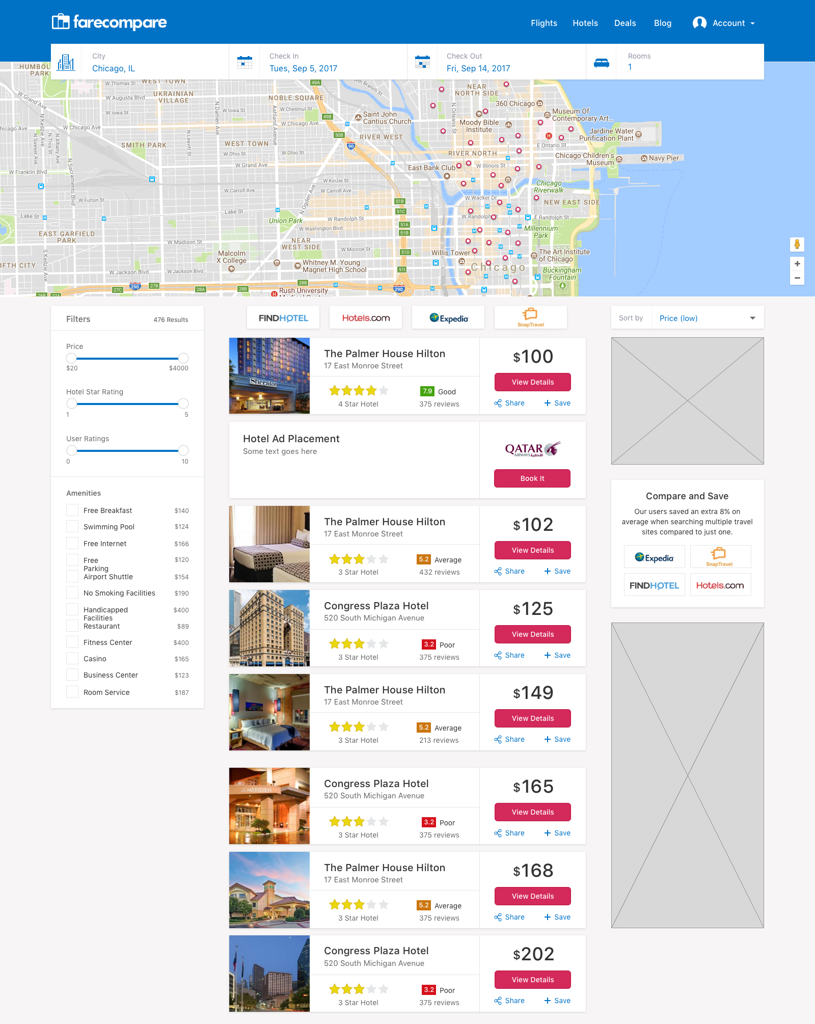
Hotel results used a similar layout to flights but incorporated a map because location is often key for travellers.
There are various personas we wanted to address:
- Set Destination and Date - Most travellers know where they need to go and when, they simply want the best price, convenience and amenities
- Set Date - Some user knew when they had vacation but might have not had a specific destination in mind or were looking for something within a certain budget
- Deals - Some users were flexible with their travel and wanted to get the most bang for their buck.
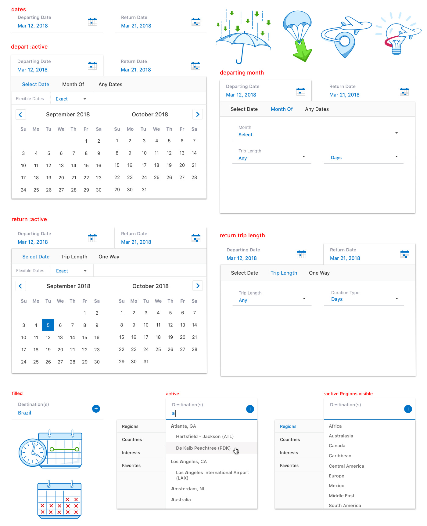
We created new advanced search tools to address different user's needs. Also, some little illustations I created.
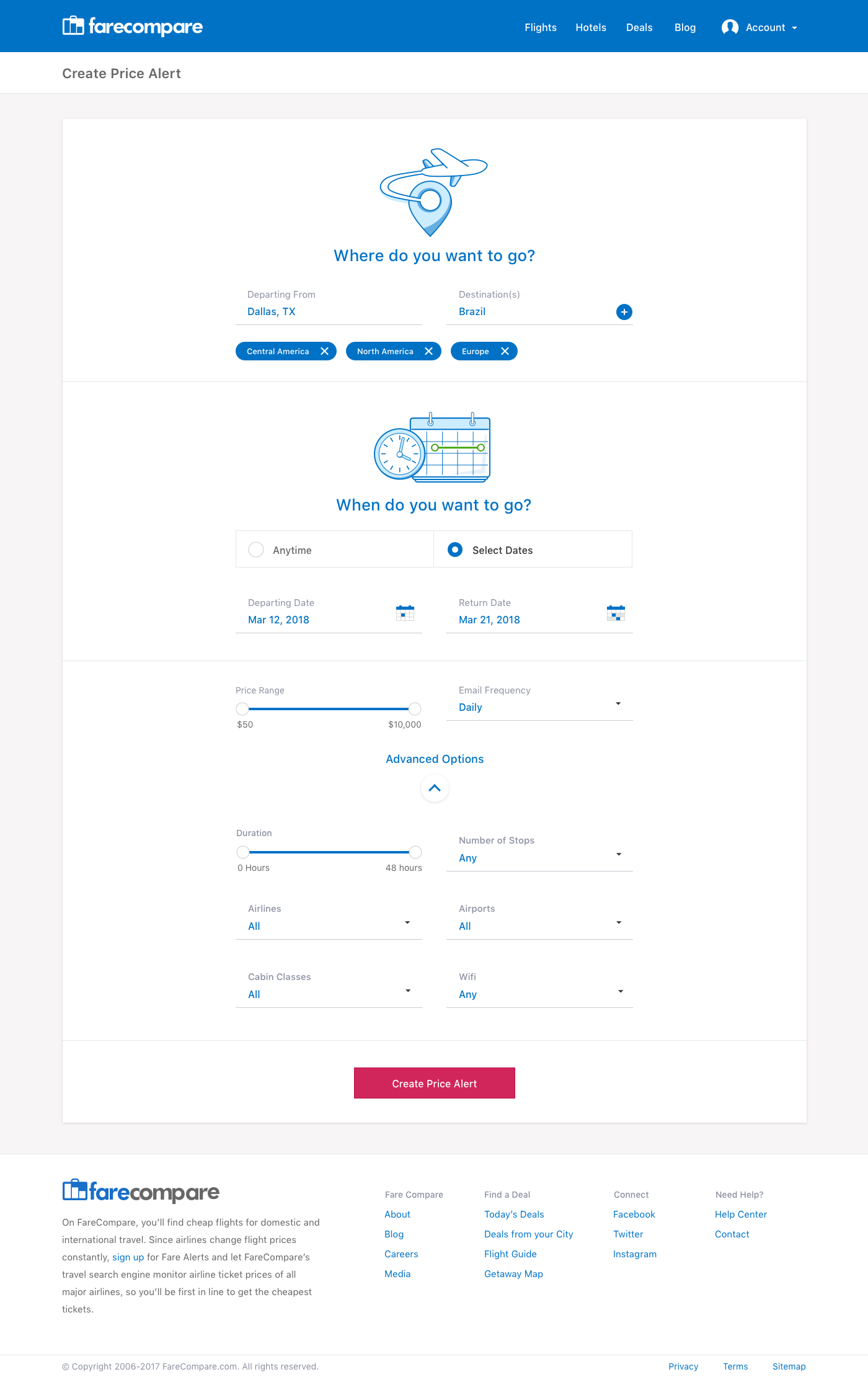
Another project was advanced options for price alerts. Instead of just the standard change in price email we'll be allowing users to select specific airlines, stops, price ranges, and lots of other features.
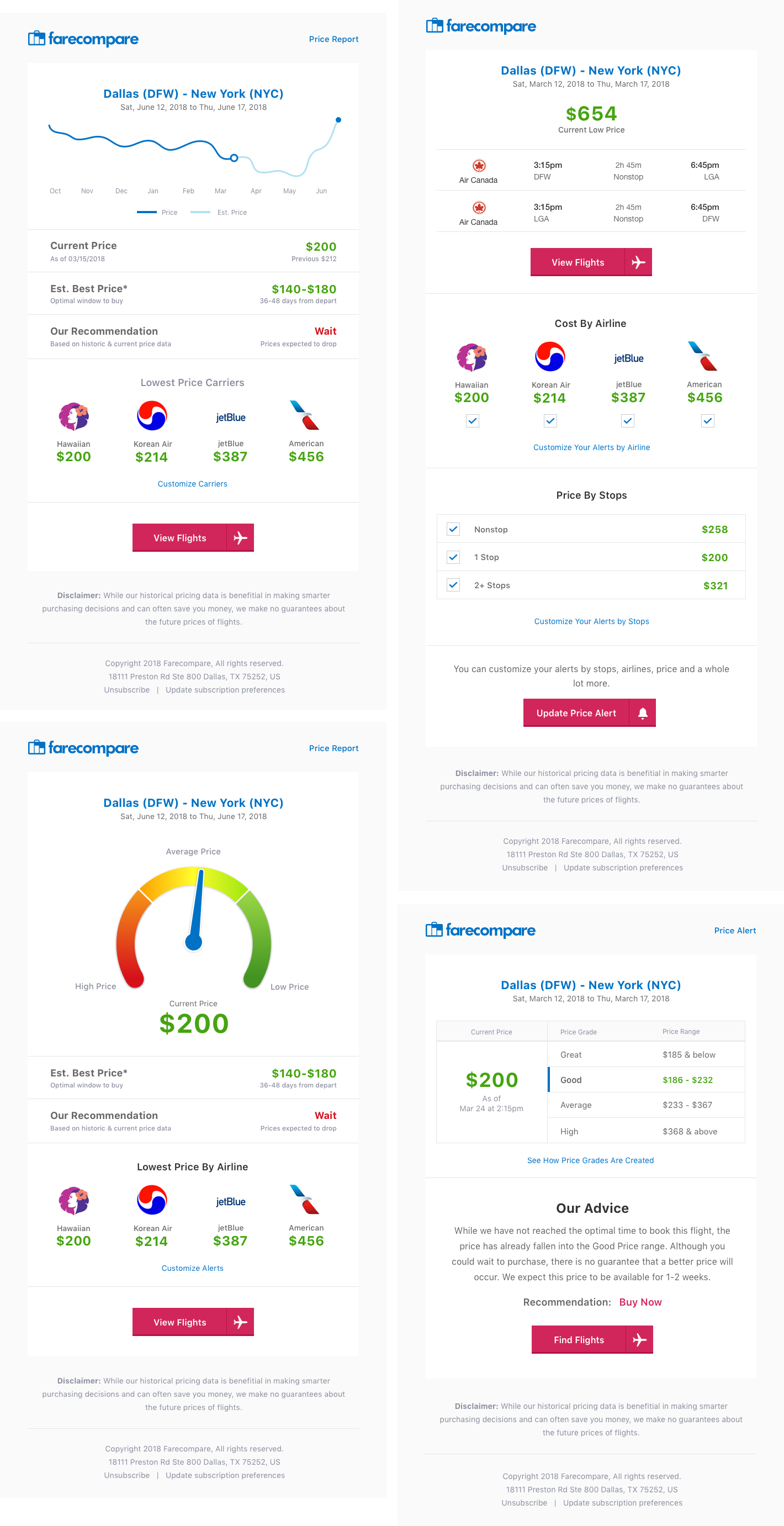
Email template concepts for price alerts, giving users even better data not only about current prices but using historic data to predict price changes.
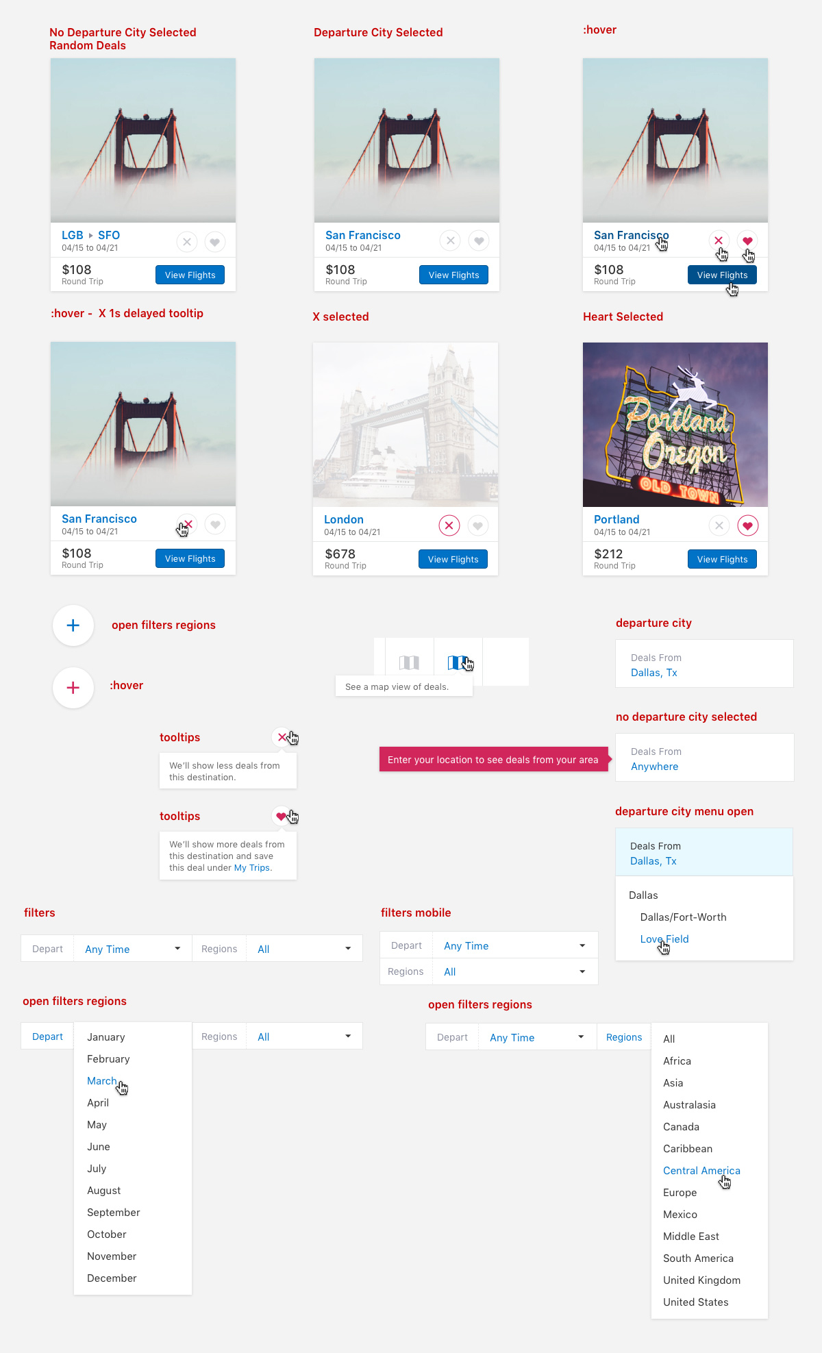
And yet another project is a deals app, which will display deals from the selected departing city or airport. This was created for users who are price sensitive but not specific on when or where they wanted to go.
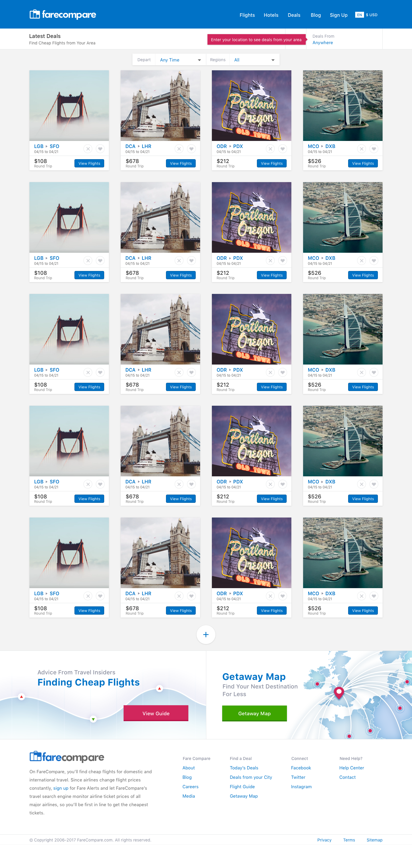
Some more styles showing the interactions for the deals. Users will be able to favorite certain destinations which will appear more frequently on the deals page and within email being sent.
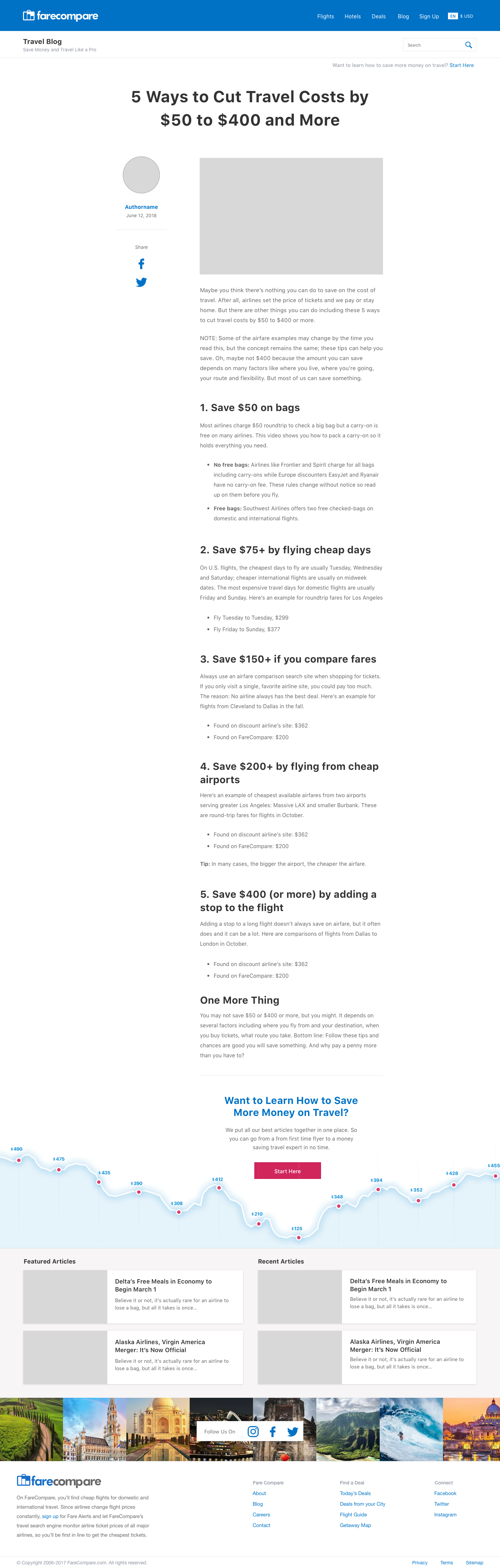
The blog already had several hundred posts, many of which were fairly short, so I went with a fairly narrow column for the body of the post. At the bottom of each post I included a link with the graph visual to give users additional content and to keep them on the site. The Start Here link went to a hub page I created with all the popular evergreen content on the blog. An easy place for users to get the best long-form content and again, stay longer on site.
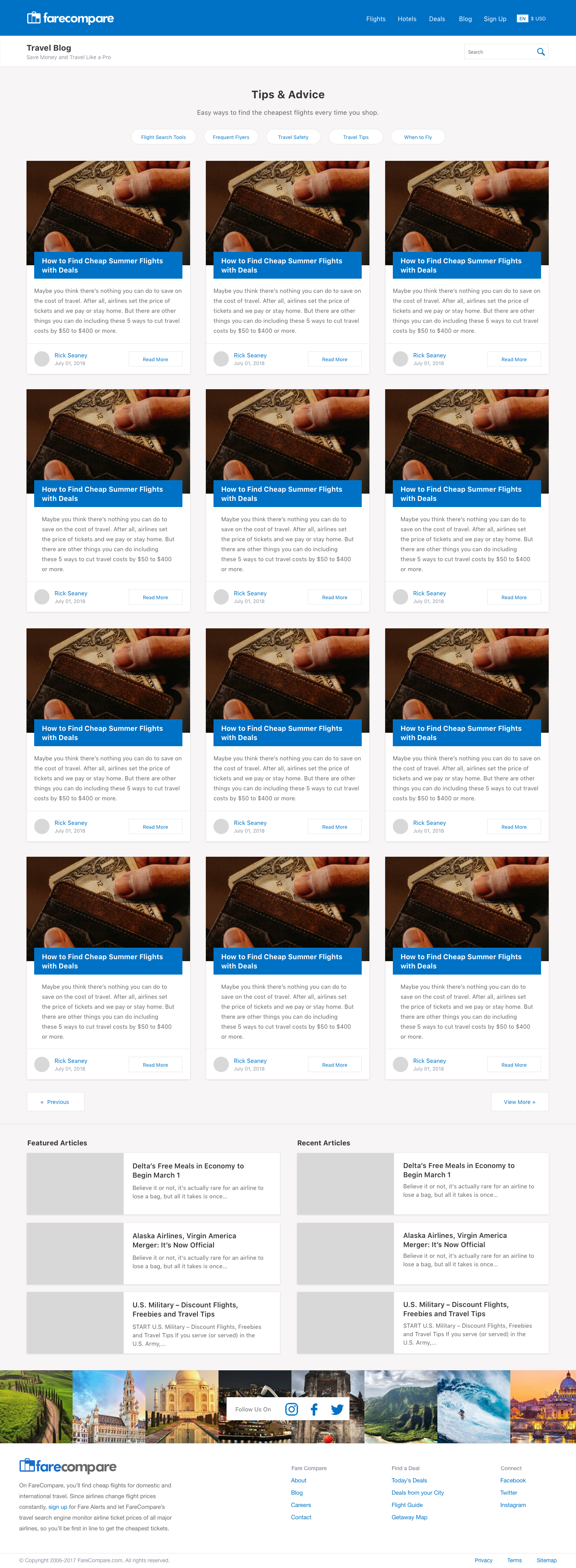
An example of a category page template. Most of these pages I designed and then created the html and css for and handed them off to our WordPress guy to turn into templates.
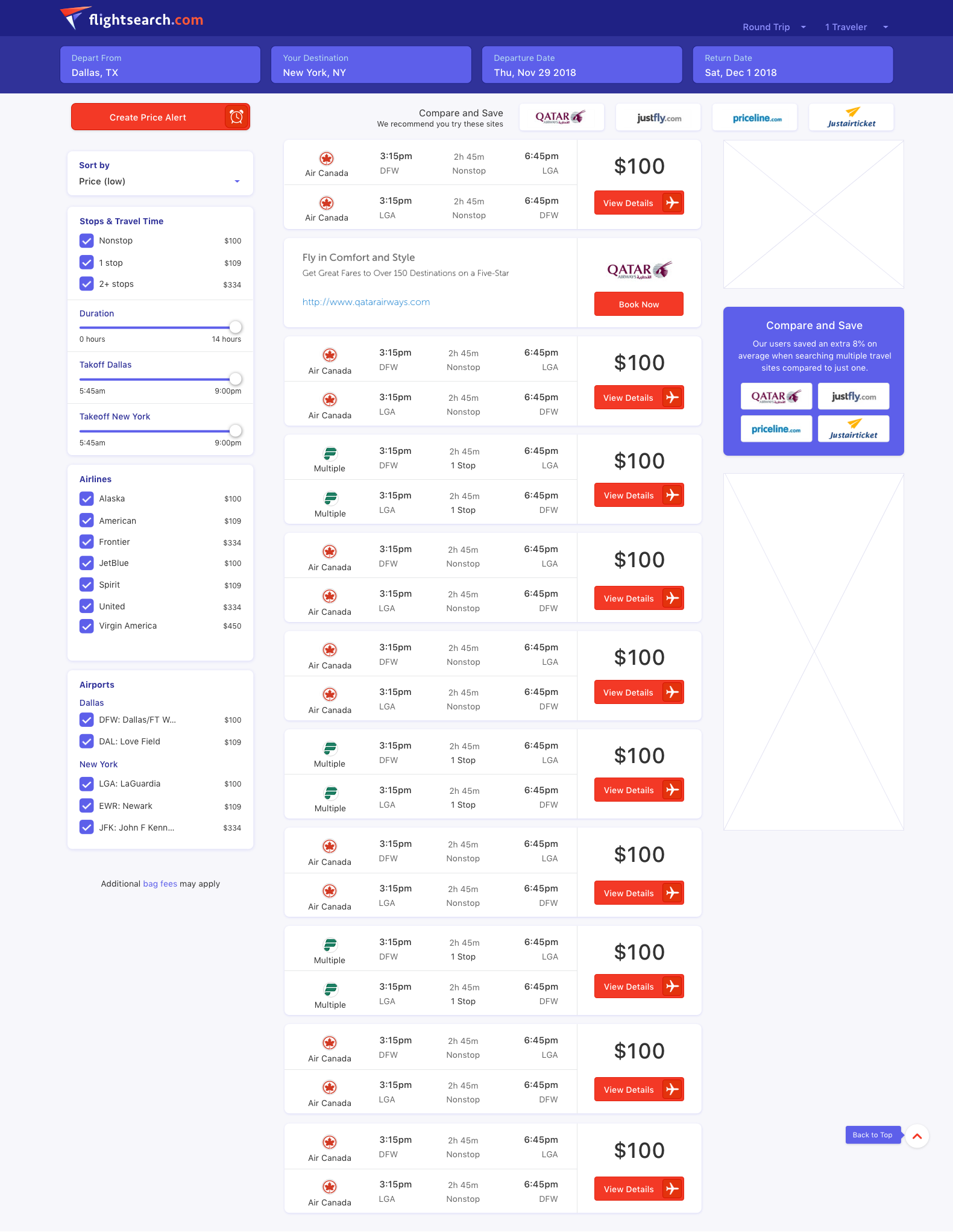
The last project was to build a seperate site with updated but not completely different interface elements. Basically, a reskin. I created a quick mark and logo and the interface for the homepage and main search pages.
The interface remained similar so the same code base could be used, just with a design refresh to the colors and styles of the elements.