Designing Cloud Director
At Simpson Strong-tie I took over the designed and prototypeed Cloud Director, a workflow platform for truss manufacturing plants to get it ready for production. The users span office and production floor, from schedulers to plant managers to builders, where a bad design decision costs real operational time and money, not just friction. A growing focus was our largest, multi-location "whale" accounts, whose workflows didn't fit neatly into how the product was originally built. Everything below is less a list of features and more a record of how I think about speed, quality, and where AI actually helps versus where it needs a human check before it reaches a customer.

Team
- Project Managers (2)
- Dev Lead
- 5 Engineering teams with 3-5 devs

My Role
- Interface Design
- Discovering & User Interviews
- Dev Handoff
- Prototyping

Duration
- 9 months
Finding the Gap: Prototype Infrastructure
Simpson's internal AI prototyping tool, Abacus, doesn't support cloning or forking prototypes and isn't really setup for collaboration. I proposed a new server setup and app to display all prototypes and allow users to share or if not clone a project to create iterations. This way, users can a/b test features or at least work on shared projects. Also added functionality for commenting so people can provide feedback within the app and pin them to specific areas of the screen.
Splitting Time: Launch Readiness v. New Features
Cloud Director had to be ready for a trade show release date, which meant I was splitting time between new features and discover and getting the product ready to ship. The design system was already outdated, but replacing it wasn't an option since we were locked into Telerik on the front end, so we were extremely limited in what we could change. On top of that, several dev teams were building in parallel without much review before implementation, so real inconsistencies had piled up across the product by the time launch got close, with limited bandwidth left to fix everything we would have wanted to.
We were also getting pressure from management to get the application looking polished for release. Given the deadline and constraints, I ran several design cleanup passes to catch and document issues, then fixed what I could myself. I got access to the dev environment and wrote CSS directly, since that was the fastest way to close the gap before release. Along with tickets for other cleanup items. I reviewed the app end-to-end, focusing most the core workflows, and then redlined everything that was questionable and prioritized it with our PMs.
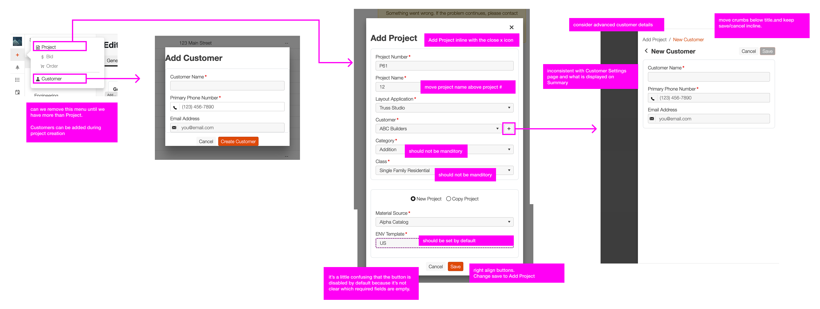
I outlined the issues with many of our core flows in the app to bring them to attention to the team and propose updates. As you can see here, two separate ways of creating customers, very inconsistent css and style treatments, and lots of areas for improvement. I left most style issues out of the notes as I could fix most of those myself.
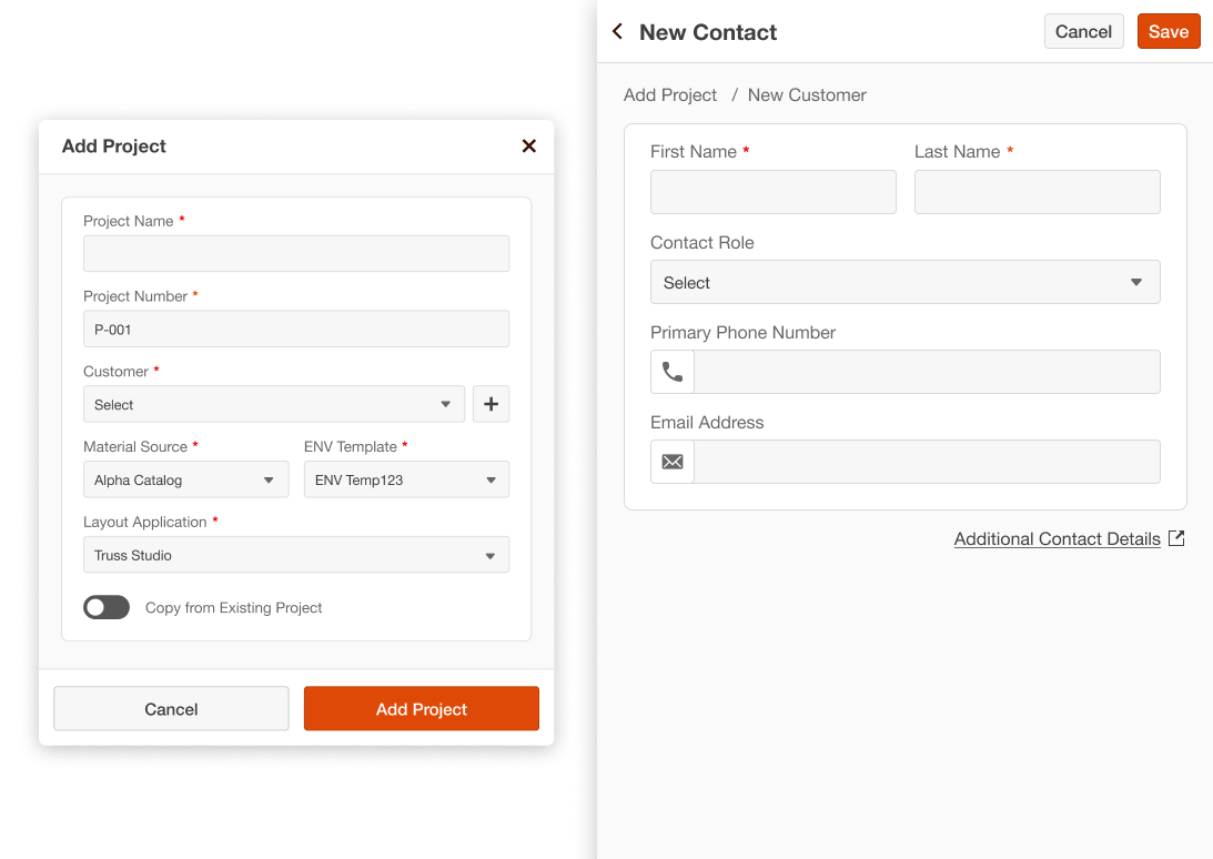
Some cleanup to the create project modal and create customer drawer. Far from perfect but what we were able to do with the time crunch to get the app ready for release.
At the same time, launch wasn't the only thing on my plate. I was interviewing beta users for feedback and designing features for the post launch roadmap, so a good part of this period was moving between getting the current product ready to ship and shaping what it needed to become next.
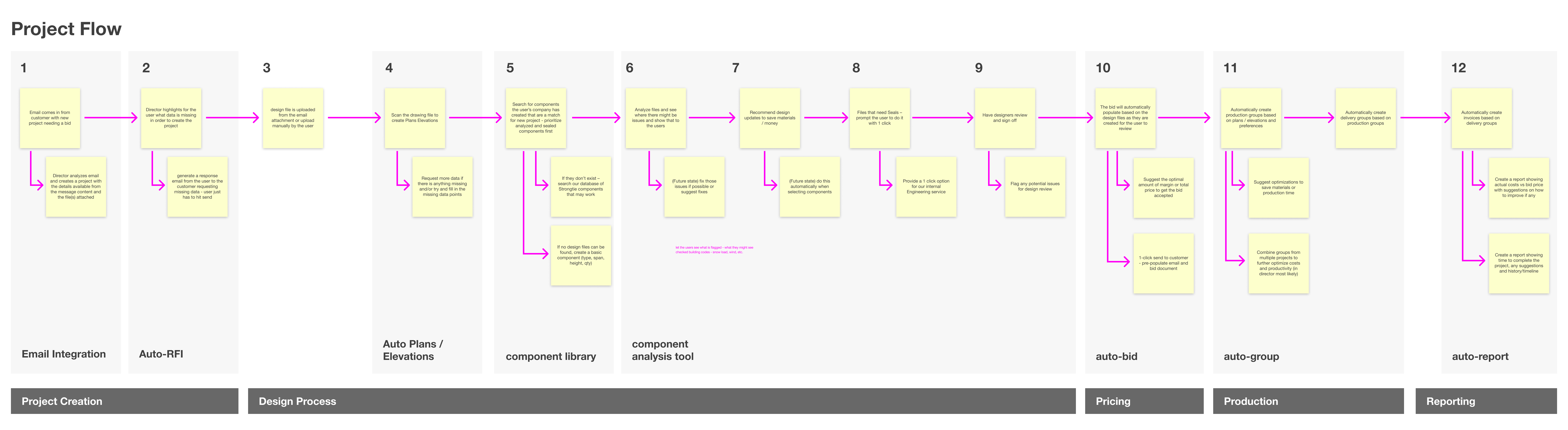
There are many tedious steps from taking in a new project from a customer to getting paid for that work, so I outlined the general process and highlighted places Ai or general automations might come into play to speed things up.
Simplified Pricing Process
One area of the app I was having issues with way pricing and with the project model wanted to address. Currently every design component in a project shows up on the pricing page, whether you want to price it or not. So I designed and prototyped a new workflow where you can add designs to pricing or select designed components directly from the pricing page.
The real reason behind this was user feedback. Components might not be designed at all at the bid stage or very roughly so, so its better for the customer to be able to add a line item bid, then replace the costs when the components have been designed. This redesign makes it super easy to select the components you want to add to a line item. You can either replace the pricing details or if the bid has already been won, just update the cost of the materials.
Project Model Updates
The big post release feature update I was doing research on and designing in Figma and Prototypes for was the project model update. Our initial release only allowed a user to create a Project that contained one set of designs and pricing details that could be sent to production. But there are many ways a customer might want to setup a project. For example you might have multiple bids open at once, each bid could have more than one order created from it, and each order could have change orders created from that.
This fundamentally changed how the app looked and functioned. Updated navigation, subnavigation, project types, statuses, task groups and types ... it really changed everything but opened up the app to be flexible enough for customers to work they way they wanted to work, and account for those large projects like subdivisions and larger multifamily projects. One of the key business objectives of this was to go after larger customers who were doing these bigger jobs, so having this functionality was critical.
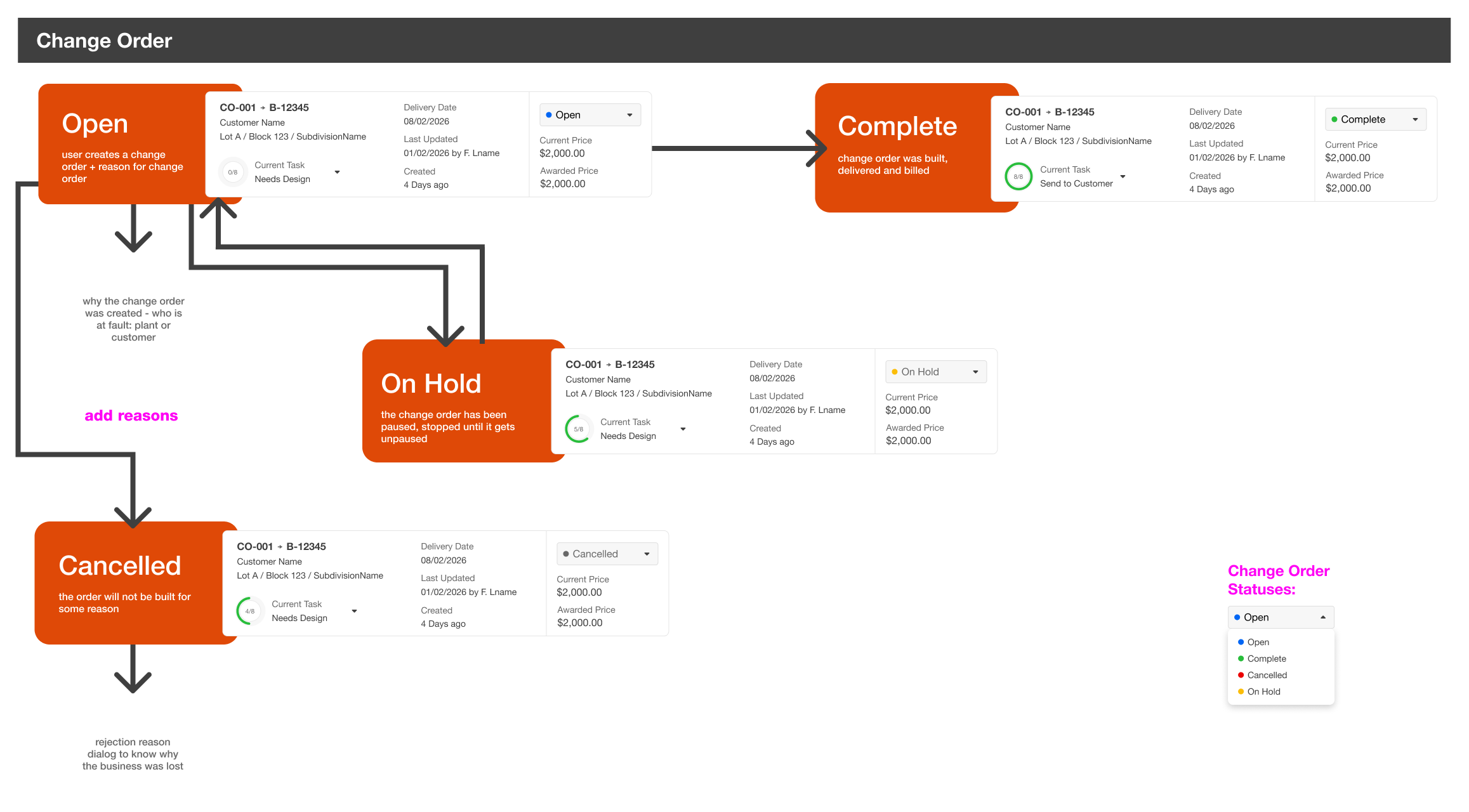
One of those bigger pieces was the Project card. Within a project you could have any number of bids, orders or change orders. So I needed to create a way to display what was relevant to the customer without overwhelming them with data. Tasks are also a core piece of the equation, so I wanted to bring up tasks statuses there as well, to prevent the user having to always click through to make updates there.
Additionally, customers have really been asking for ways to create edit custom workflows. So I created a prototype to show this type of behavior. A user would be able to define the content of the table by selecting columns, also be able to select from all tasks for tracking purposes and create custom filters on top of this to create highly specialized views. These view could be shared with others or set as defaults for specific roles in the company. This way everyone can have workflows setup just for their specific tasks.
What this taught me
Working inside Cloud Director's constraints, an outdated design system, a fixed Telerik front end, a hard launch date, made the case for something I keep coming back to: speed and quality aren't actually in tension, they just need different tools pointed at different problems. AI closed the distance on the parts that could move fast, prototyping, exploring workflow options, testing ideas with customers before committing engineering time. The parts that needed a human check stayed human, the redlines, the pricing logic, the decisions about what a truss plant worker actually needs versus what looks clean in Figma.
That's the muscle I want to keep building. Not choosing between AI and craft, but knowing which one a given problem actually needs.
